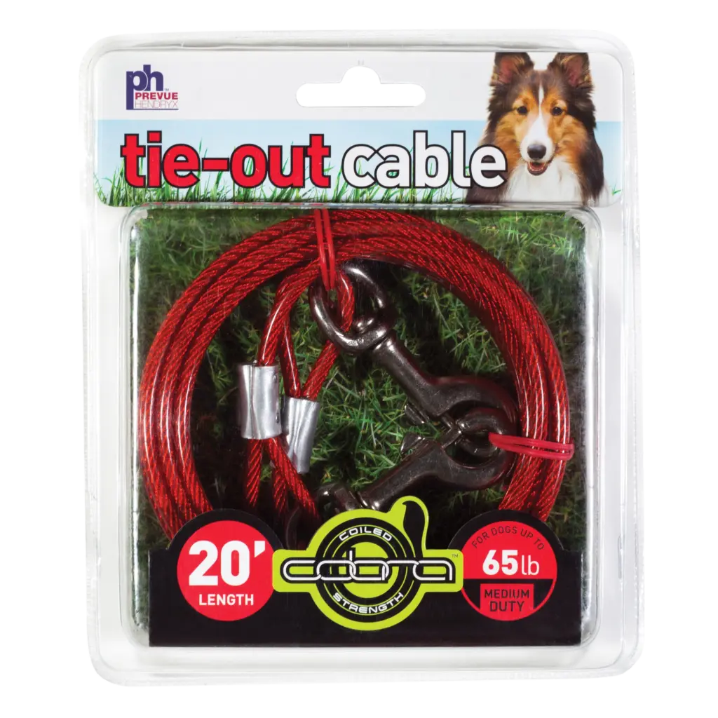
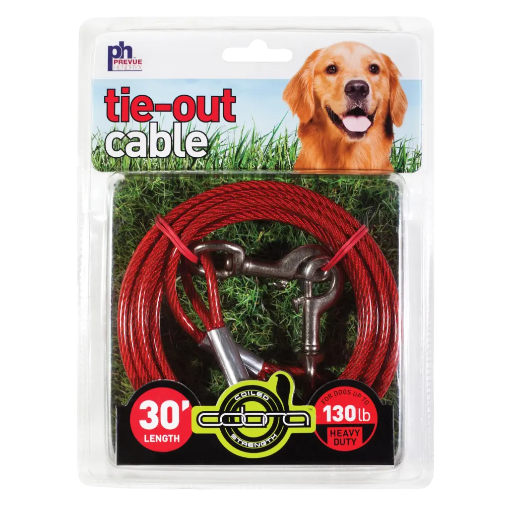
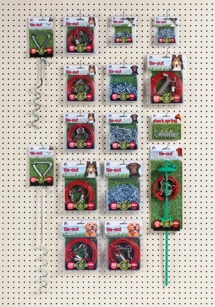
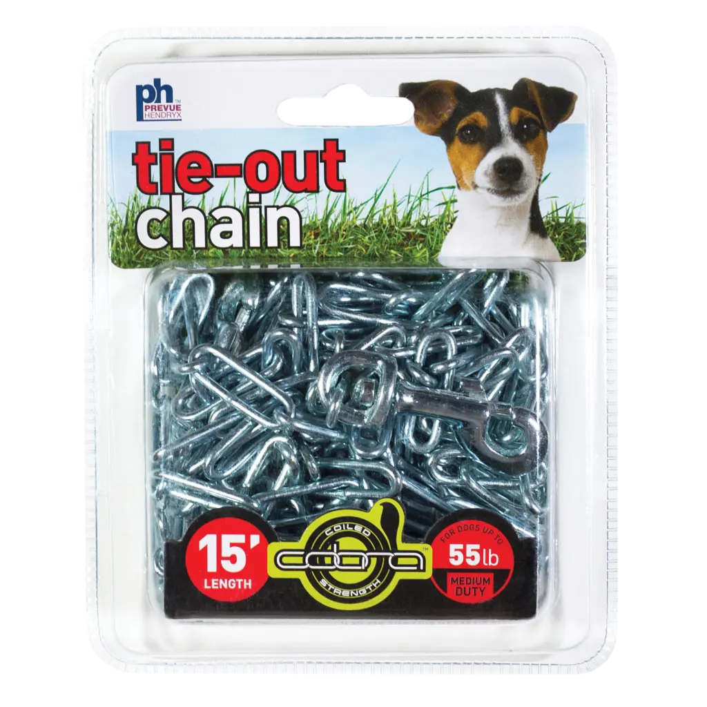
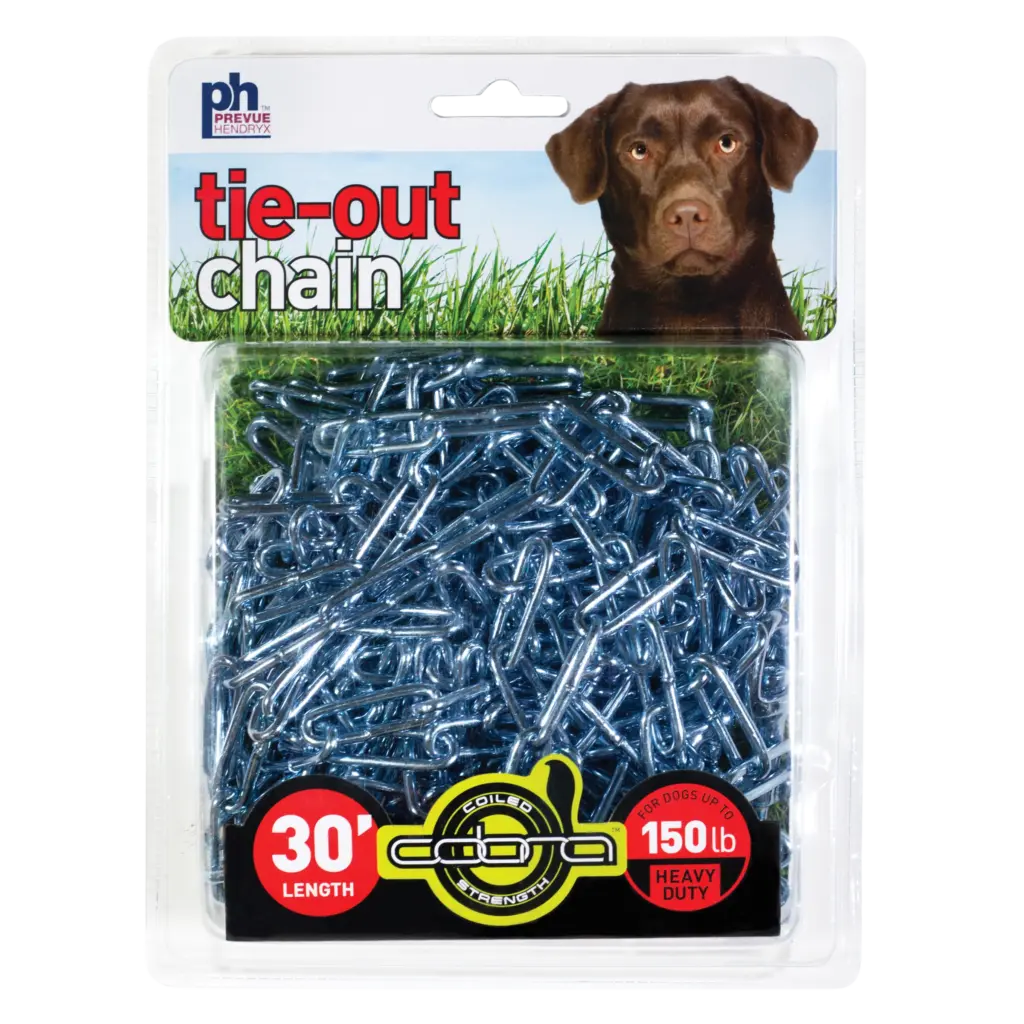
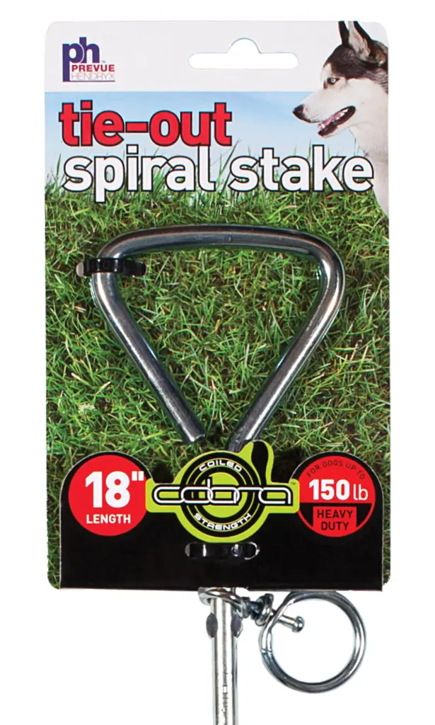
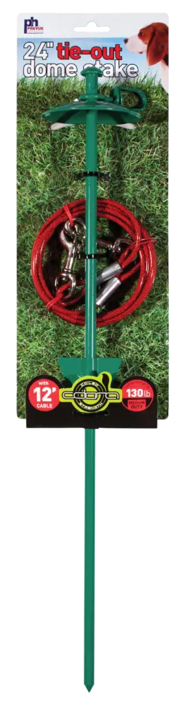
Updated older, existing packaging with a unifying style for the entire dog tie-out line. Turned the existing “COBRA” wordmark into a full logo identifier. Image selection and use was designed to quickly equate the products with the outdoors, as well as offering a visual contrast to the bright red cable coating.
Designed the packaging with a die-cut fold that cradled the product, added dimension and visual interest, and put a focus on length / logo / weight-limit details. For tie-out stakes, I designed smaller cards which carried the same design forward, cradled the essential components, hung balanced and true from the card, and cut the paperboard use by more than half.
PROJECT CREDITS
CLIENT // Prevue Pet Products
PROJECT // Dog Tie-Out Retail Packaging
AGENCY | PARTNER // Joslin Lake Design
DESIGNER // Andrew Rogers
LINK // Prevue Pet Products