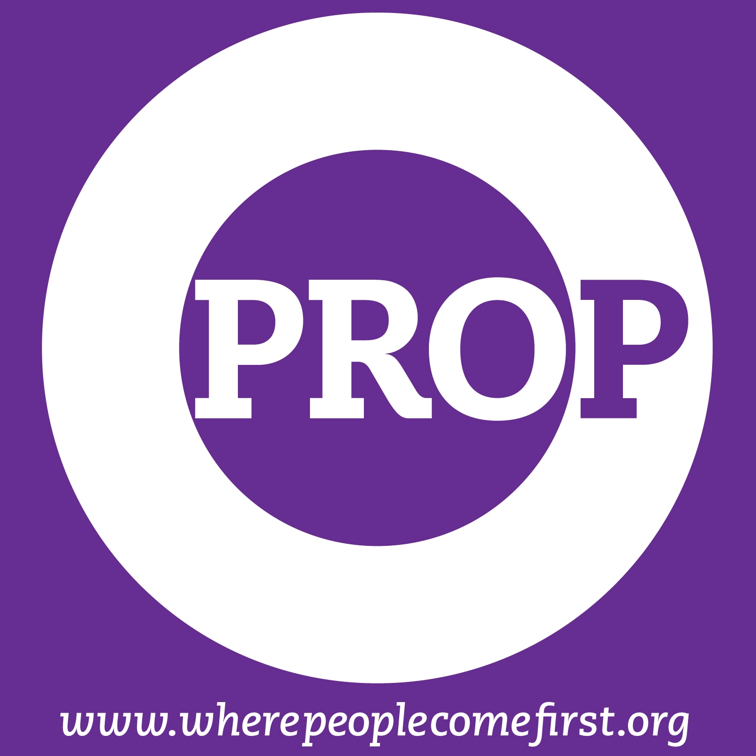
Designed a versatile logo for the People’s Regional Opportunity Program that helped to pull together a large variety of social service programs under one recognizable umbrella brand.
The concentric circle logo depicts their services expanding out from a central point to the wider community; People’s Regional Opportunity (“PRO”) is at the core, to place emphasis on their main mission of offering better opportunities for the people in the region.
The logo dot was adapted to a wide range of uses on everything from buildings, signage, tote bags, brochures, PROPeople Magazine, and more, and quickly became an iconic symbol in the community.
PROJECT CREDITS
CLIENT // People’s Regional Opportunity Program
PROJECT // Brand logo and identity package
AGENCY | PARTNER // Joslin Lake Design
DESIGNER // Andrew Rogers
LINK // Opportunity Alliance