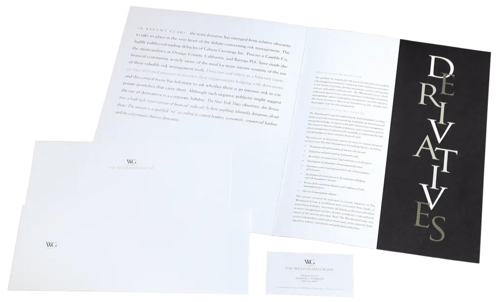
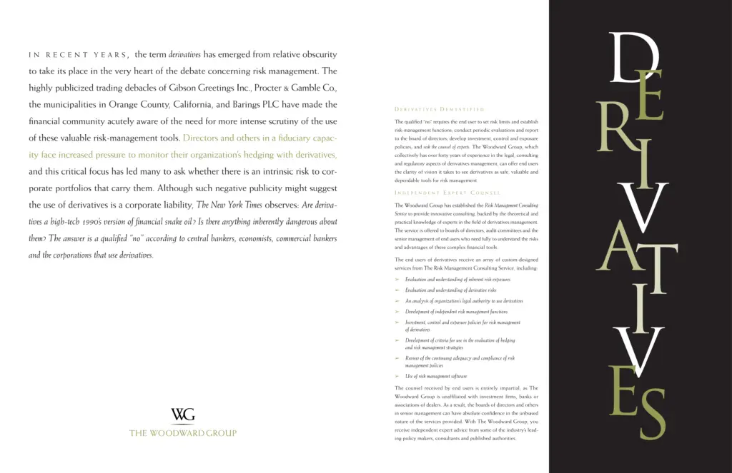
At a time when derivatives were new and not well understood, The Woodward Group was founded, with a goal of demystifying the financial vehicle and guiding investors through the territory.
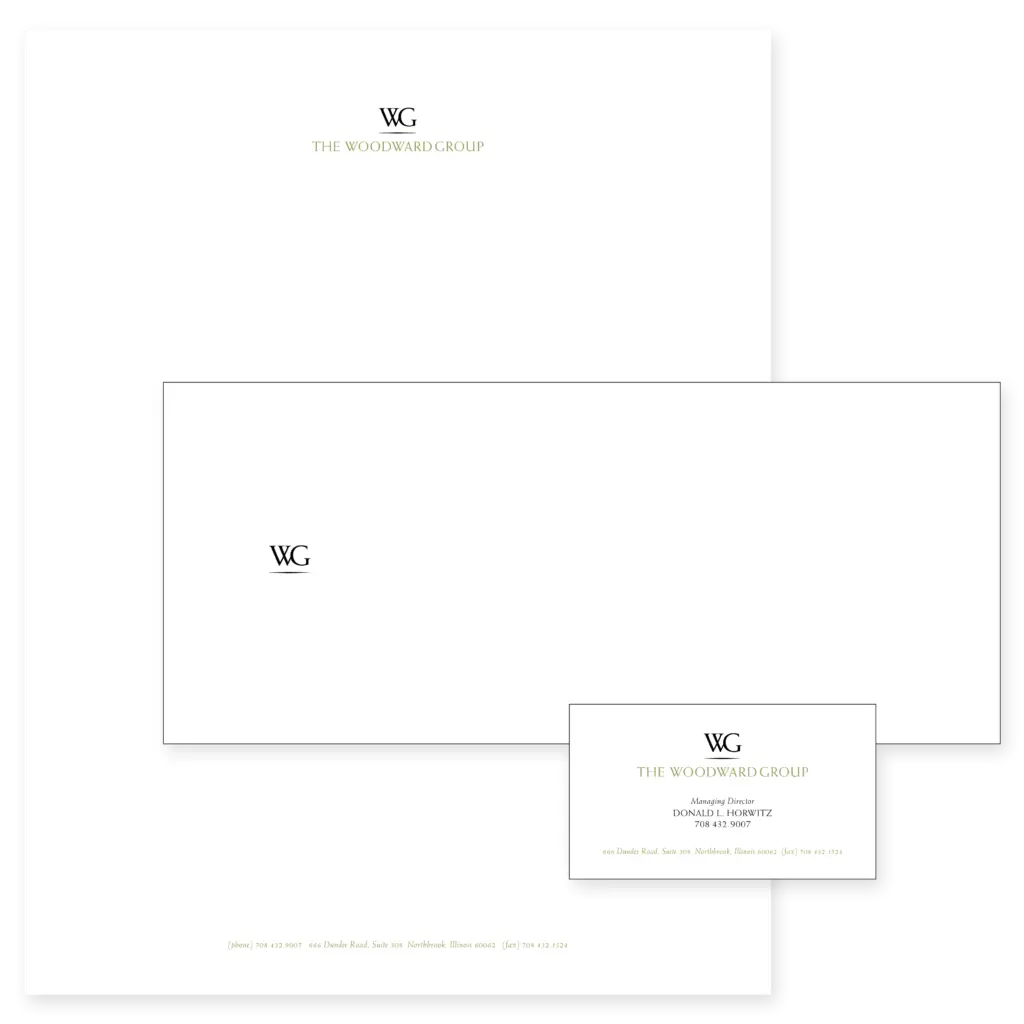
I designed an elegant logo and tasteful stationery package for The Woodward Group, and for the sales brochure, I designed the cover typography to be jumbled and somewhat unreadable, which, upon opening, became resolved and readable. Conceptually, it was an allegorical visual for how The Woodward Group would turn the confusing jumble of derivatives into a comprehensible investment vehicle.
PROJECT CREDITS
CLIENT // The Woodward Group
PROJECT // Brand, identity package, sales brochure
AGENCY | PARTNER // Joslin Lake Design
DESIGNER // Andrew Rogers